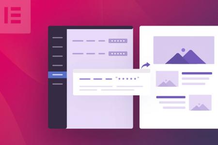
Top menu navigation matters
First of all, global page navigation really matters. Although we often think that users are willing to scroll to find content, our recent testing and recording of heat maps shows the main navigation always attracts a lot of activity - especially for desktop users.
Our testing suggests that for desktop users, scrolling is far less natural. The main navigation is the primary tool for users finding content.
Your main navigation should be considered one of the most important elements to get right and optimise. This is why we spend a considerable amount of time planning site maps when we re-design or new build with our clients.
There are three main principles behind good site navigation.
- Be clear - The navigation should give complete clarity as to what the user will find on the page if they click on the link.
- Be quick - A user should be able to find the content they want quickly, and without thinking too much.
- Be consistent - The navigation should remain consistent across all pages, but also should be consistent within its own structure and wording.
Let’s look into this in a bit more detail.
The size matters
A few years ago there was a web design trend for mega menus. A mega menu is essentially a massive menu which displays dozens of page links when you hover or click on the top level link. Some even go to extremes and include images, featured blog posts and products!
The trend was clearly driven by design decisions rather than user experience, because they are a nightmare to use. Thankfully they have become less popular in recent years.
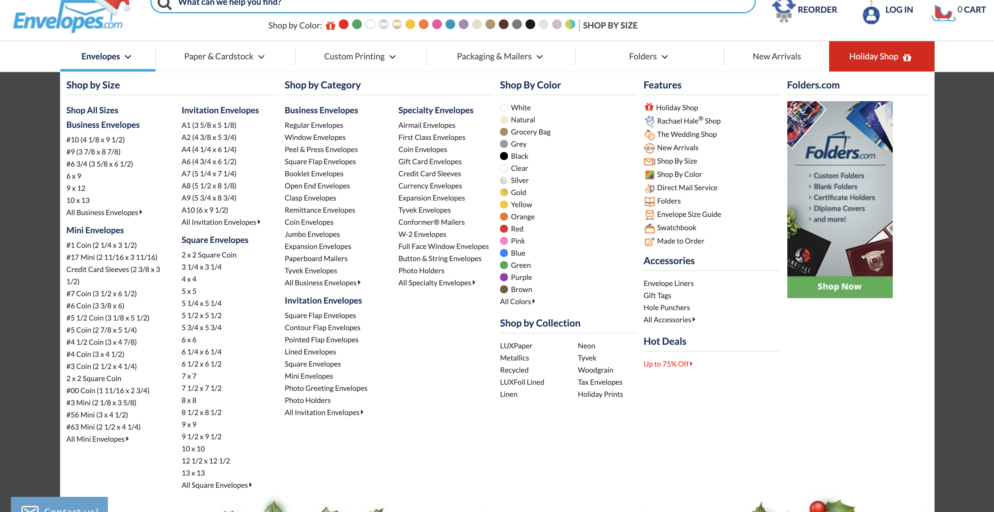
Look at the size of this menu!
If a user is bombarded with too many options they will be confused and visually fatigued. It just becomes a visual mess and every link blends into each other.
We want it to be clear.
A user should have a good idea of the layout of your site at a quick glance. They shouldn’t have to spend two minutes reading every link and hovering over every drop down menu.
Not everything can be as important as everything else. This is something that a lot of websites have problems with.
In my recent blog post about planning your charity website I mentioned deciding on what the single most important thing on your site should be. This pricincle should be reflected in your menu design. Focus on the most important things.
To do this, you might have to group together key themes or topics. For example, History, Meet the Team, Volunteers, Vision and Values, Policies and Charity Statement can all be grouped together under ‘Who We Are’ or ‘About Us’. They don’t all need a place in the main menu. Instead they can be included in a separate sub menu within the ‘Who We Are’ section.
If your website design has a traditional horizontal menu at the top (and there are lots of reasons this is a good idea) then you are going to be limited to the width of the monitor or device your site is being viewed on.
I see this limitation as a really good thing. It forces us to think more carefully about what we are adding and to be more ruthless in getting rid of things that are not essential.
Unfortunately, many sites see drop downs as the solution to this limitation. Here we have far less constraints - and can cram dozens of links in. For some websites, a second level of dropdown creeps in. Now the user is having to carefully move their mouse over three levels of links to stop the menus changing or disappearing and having to start the process all over again!
We have all done it!
It should go without saying that third level menus should be avoided, and just because we have more potential room for second level, we should still be just as ruthless in our optimisation of them.
The wording matters
Getting a user to click on a link on your website is perhaps harder than you might first think.
It is easy to assume that if a user is on your site they are instantly interested in what you do and will merrily navigate around your site visiting numerous pages and consuming your (most excellent) content.
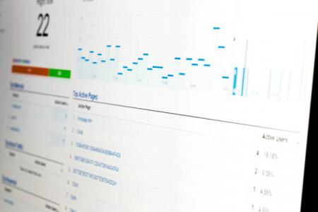
I am always interested to find out how many average pages per session a user views on a website. This is easy to find in Google Analytics under Audience->Overview. These numbers are often disappointedly low.
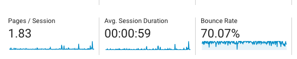
Low session numbers and high bounce rate!
You need to treat a user’s click on your site as a precious commodity. You need to earn it’s trust. Treat it with the deepest of care.
The links in your navigation need to do two things well.
- Convince the user to click
- Deliver what is promised
You need to be able to convince a user to click on the link. It needs to be clear, enticing, and simple. The user doesn’t want a mystery. Subconsciously they will be far less willing to click on a link if they don’t know where they will be redirected. This would mean they would have to go back, which is a waste of time and instantly destroys trust and goodwill.
They don’t care about clever menu names where the first letters spell out your charity's name (yes I have seen this!). They don’t care about arty single word links that are cool and trendy (but confusing and meaningless), and they don’t care about internal references or words that they don’t understand.
Secondly, you need to deliver.
If a user clicks on one of your links they want to instantly find what they expected - they don’t want a surprise. It can be good practice to use the main heading on the page to match up to the menu title. This helps reinforce the message for the user.
Deliver on the user's primary expectations first. Don’t call a page ‘Meet our Volunteers’ and then instantly hit the user with how they can sign up to be a volunteer. This should be further down the page.
Take a moment to go through the links on your main navigation now. Read out the link title and then write down what you would expect (as a visitor) to find if you clicked on the link.
Does this match up with what you get?
Once you start to think of a user's click in this more fragile and competitive nature you start to care much more about your links, the wording and the pages they point to.
The order matters
From our recent charity website audits and research we discovered that the order of the menu seemed to matter. Perhaps more than we thought. Take a look at the screenshot below.

This is a trend we have noticed across a number of sites. Whatever is positioned first gets more clicks. It is certainly where the majority of mouse movement is. I guess this makes sense, people read left to right after all, however it would also suggest that even on small menus, users might not bother to read all the options before starting an action.
So what does that mean when we are planning our menus. Well I would suggest it makes sense to add your principle/most important thing first. Don’t waste that primary location on a About Us page link (unless that is really important) or even a link back to the home page (clicking the logo can do that).
Use that premium spot wisely.
The overall impact of this might be fairly minimal, but if we are keen to squeeze as much as possible out of our websites, this is worth considering.
As a slight aside. It might be worth considering highlighting your main action in a different way on your menu. For example, a sign up, or donate link might be better styled slightly differently to make it stand out a bit more.
We have done something similar on our website to request a free charity website review.

Moving this to the end of the navigation and giving it different styling drawings the eye to it. This has more visual draw than merely the order of the main menu.
The consistency matters
It probably should go without saying, but your top menu should remain the same across all your pages. No matter where a user finds themselves on your site, they should find that the menu is a constant. Most websites are built this way. Most content management systems (Wordpress or MODX for example) include a single menu in the theme which means that unless you actively try and do something different, the menu will be consistent.
There is however one inconsistency that I see too often, This is when a menu has a drop down but the top level item is not clickable as a link. See screenshot below.
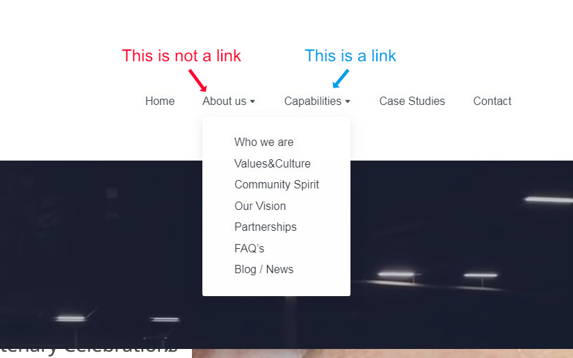
When some links are clickable and some links aren’t it is just confusing and really annoying. It is my opinion that all links should be clickable. They all look like links so they should behave like them! If you decide against this you should at least ensure that none of the top level links are. Be consistent!
This issue often occurs when the navigation is broken down into too many separate pages. For example, you have a drop down menu for ‘History, Staff, and Vision’ now there is nothing to actually add to the ‘About Us’ page. In reality, History, Staff and Vision is the ‘About Us page’.
In conclusion
Hopefully I have managed to prompt you to take a look and to think about how to plan and improve your menu on your site.
As a quick word of warning. It might seem logical to dive right in and start making changes to your menu structure. Remember though that pages will have specific urls relating to them. Changing these all over the place can cause big issues with breaking links (both internally and from external sites) so approach this with caution, and get some advice if you are not sure.
I have mentioned a few times that much of this research has come out of running website audits for charities we work with. These audits are designed to provide a deeper understanding of how users your website is working, its visitors and performance.
For example they provide the charity with information including…
- A clear understanding of your website visitors and their behaviour. What they do on your site and what content they interact with. What is working well and what can be improved
- How are visitors finding your site? What are they searching for and where there’s missed opportunities
- How your website is performing for mobile users
- How fast your website is loading and what can be done to improve speed
- A technical website audit which will highlight issues that might be holding your site back or causing search engines difficulty in ranking your pages
- What websites are linking to pages on your site including if there are any links that are devaluing your site.
- A look at any accessibility issues that your site might be having causing users issues in understanding and interacting with your content
- A look at potential security issues that might be affecting your site
- …and more
It is a really useful process and can help shed light on what areas need improving. We are so confident of its value that we offer a money back guarantee if you feel that it wasn’t at all useful.
If you are interested in an audit for your site visit our charity audit page for more information.